Let’s Talk
Back

How does a brand become a visual language?

  • Client logo
    Client
    Neufin Energy
    Industry
    Climate and Energy
    Duration
    1 month
  • Scope

    • Identity Design
    • Brand Storybook
    • Communication Strategy
    • Marketing Website
    • Ongoing Work
  • Patterns team brought the “X⁠-⁠factor” we needed for a distinctive brand architecture.

    Rahool GadkariCo-Founder @ Neufin Energy

  • About Neufin

    Neufin helps businesses navigate renewable energy procurement and management, combining advisory expertise with technology to make complex energy decisions easier.

  • The gap

    Neufin’s communication hadn’t kept pace with its offering. Presentations, outreach, and product experiences lacked a cohesive identity, making it harder to build recognition and trust across different customer groups.

  • The brief

    Design a brand identity and translate Neufin’s brand into a coherent visual language that could explain complex offerings, accommodate different customer priorities, and connect product and marketing communication.

  • The approach

    We explored the business, customer motivations, and communication challenges to identify how brand expression, visual storytelling, and information design could work together across touchpoints.

  • The outcome

    A cohesive brand identity and marketing website, supported by a brand design system that empowers teams to communicate consistently. It sets a strong foundation: tone of voice, illustration and photography guidelines, and sub-brand architecture.
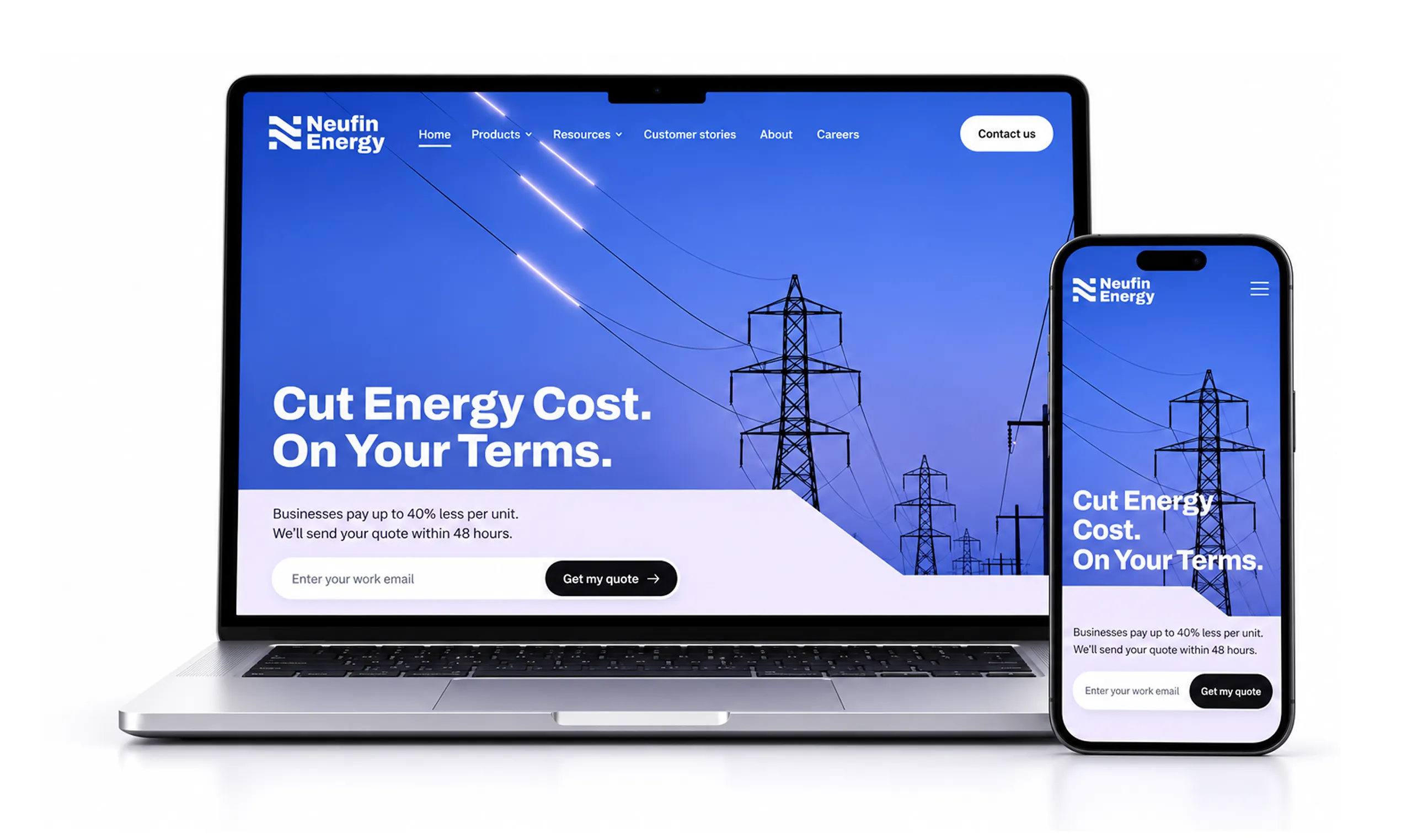
The new Neufin Energy home page on a laptop and a phone: power lines on violet-blue, the headline "Cut Energy Cost. On Your Terms." and a quote form.
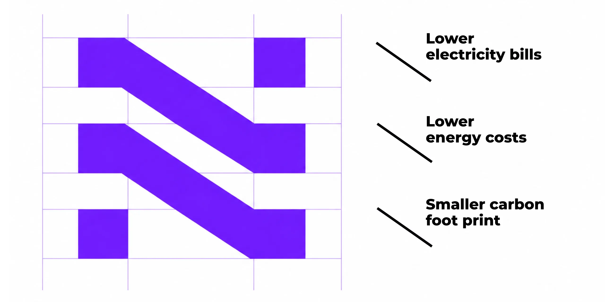
The Neufin N on its grid: three violet bands stepping down, labelled lower electricity bills, lower energy costs and smaller carbon foot print.
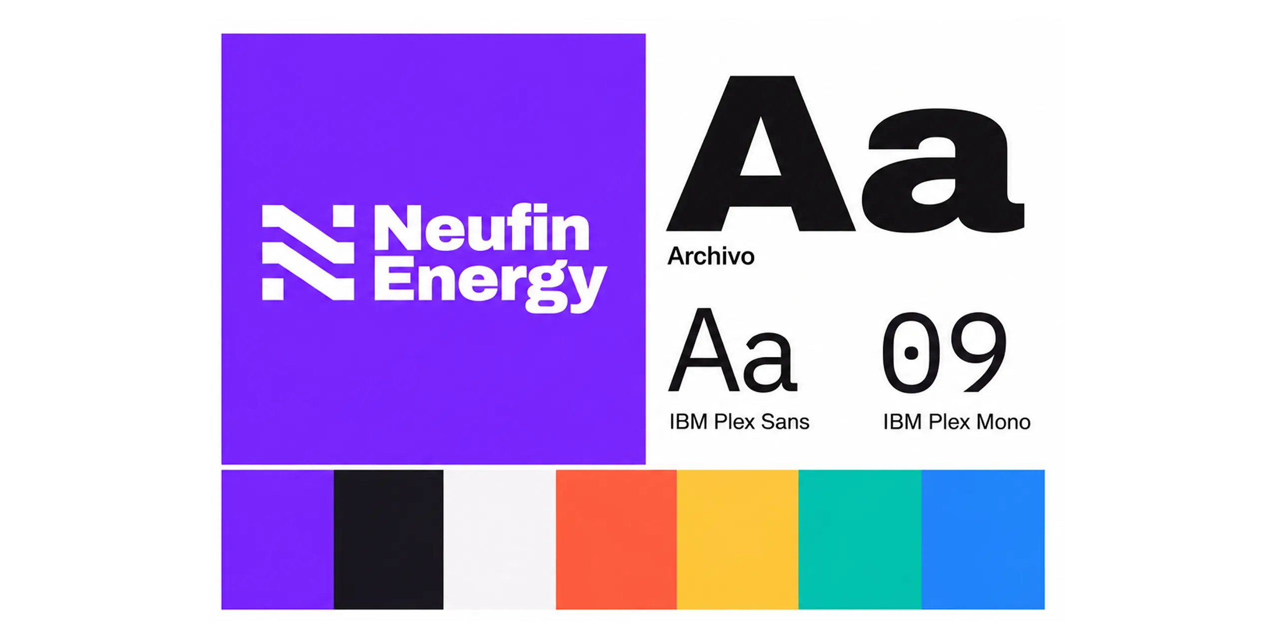
The white Neufin Energy logo on violet, the Archivo, IBM Plex Sans and IBM Plex Mono typefaces, and a row of seven brand colours.
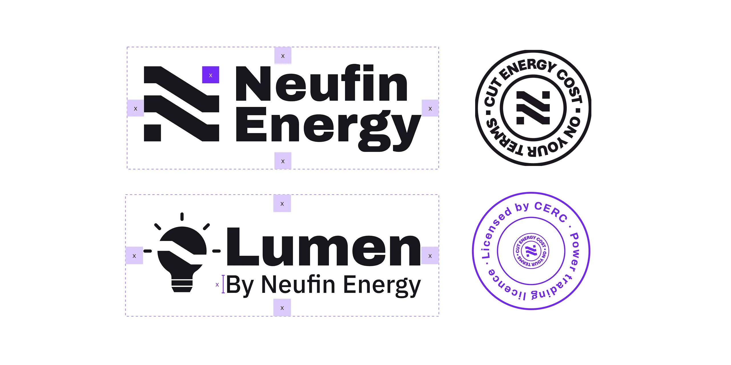
The Neufin Energy and Lumen by Neufin Energy logos with their clear space marked, beside a round "Cut energy cost on your terms" stamp and a violet "Licensed by CERC, power trading licence" stamp.
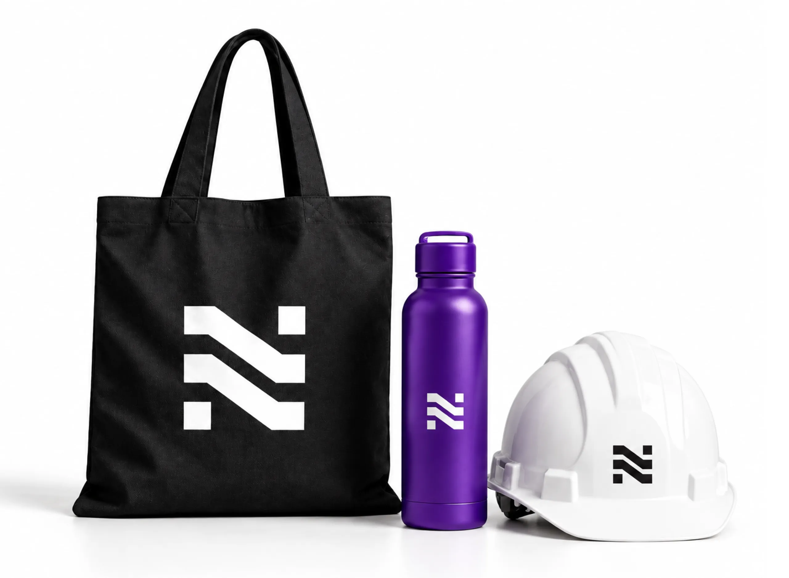
A black tote bag, a violet water bottle and a white hard hat, each with the Neufin N mark.
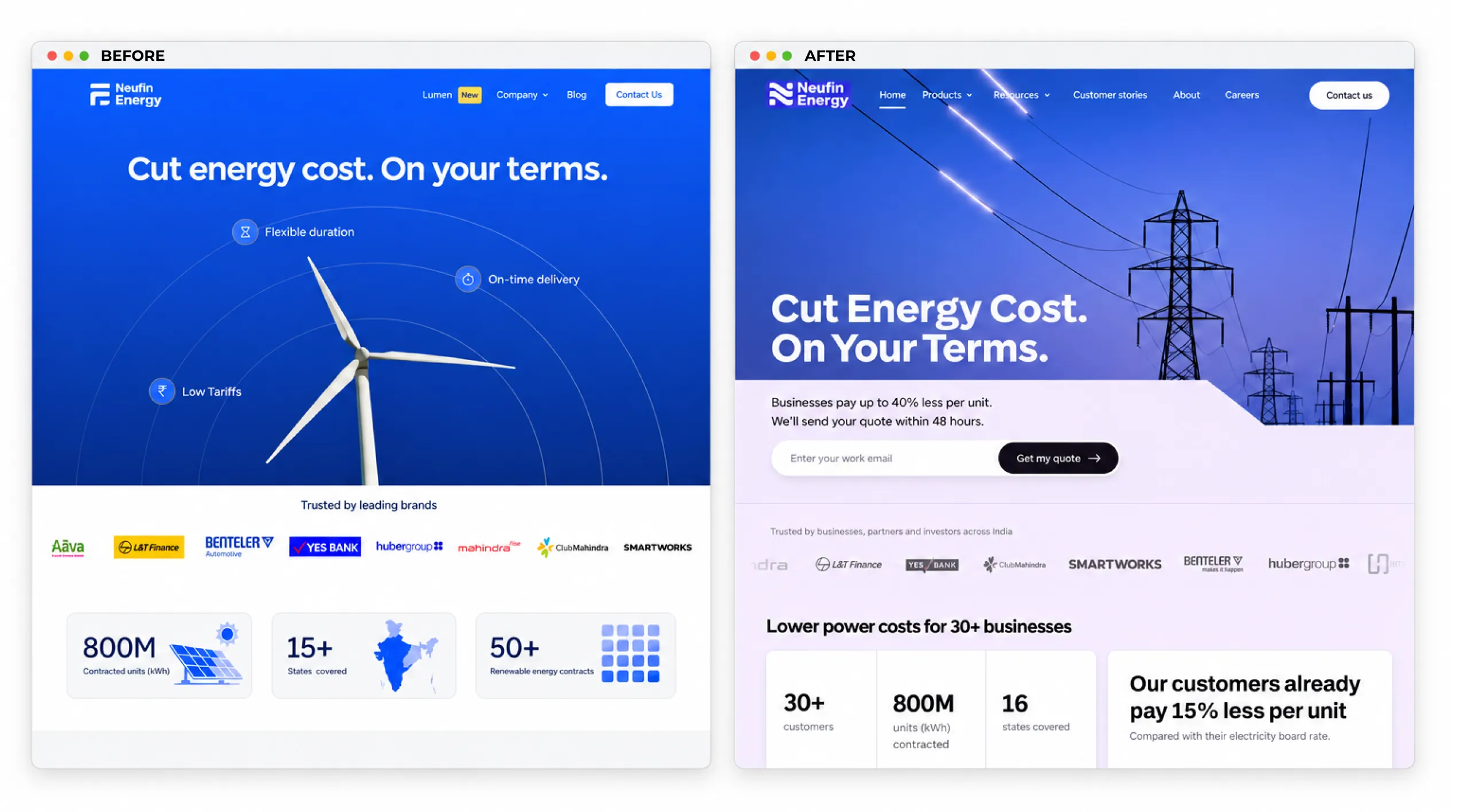
The Neufin Energy home page before, a wind turbine on blue, and after, a violet hero with power lines, a quote form and customer numbers.
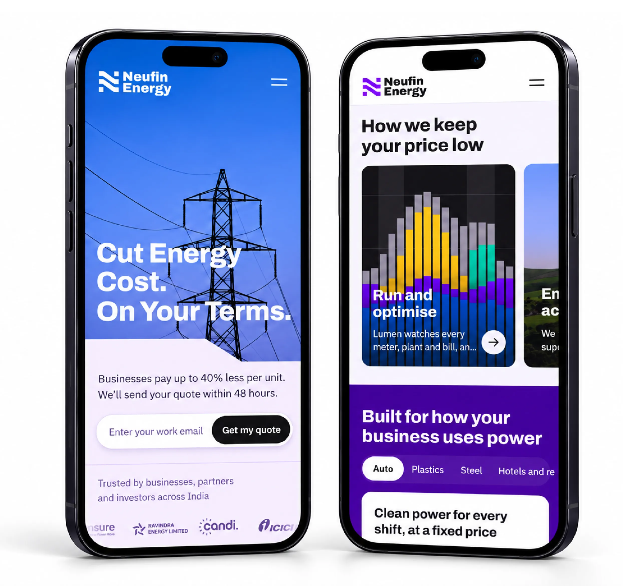
Two phones showing the new Neufin Energy website: the "Cut Energy Cost. On Your Terms." hero and the "How we keep your price low" section.
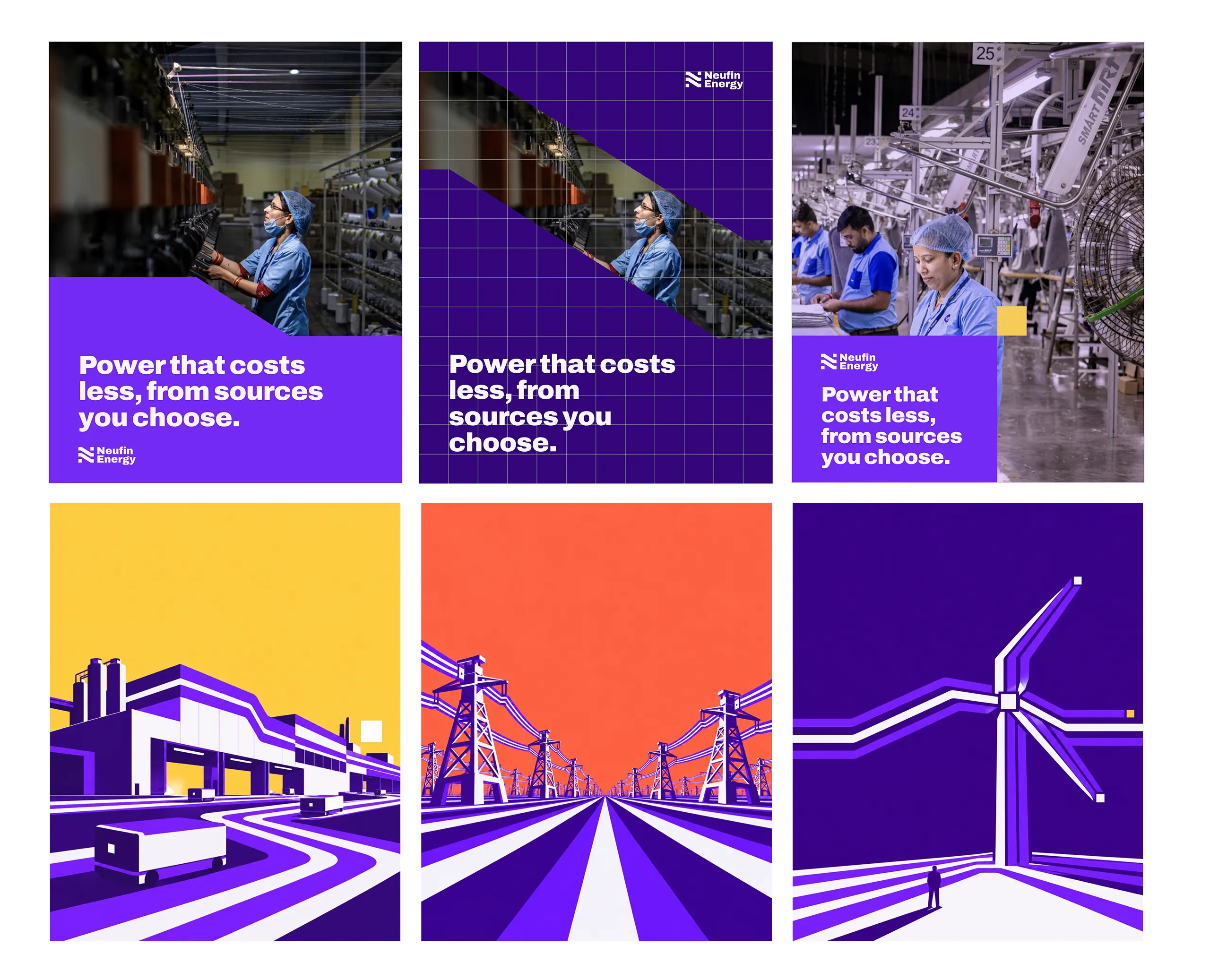
Three posters reading "Power that costs less, from sources you choose." with factory photos cropped by the Stripe, above three violet illustrations of a factory, pylons and a wind turbine.
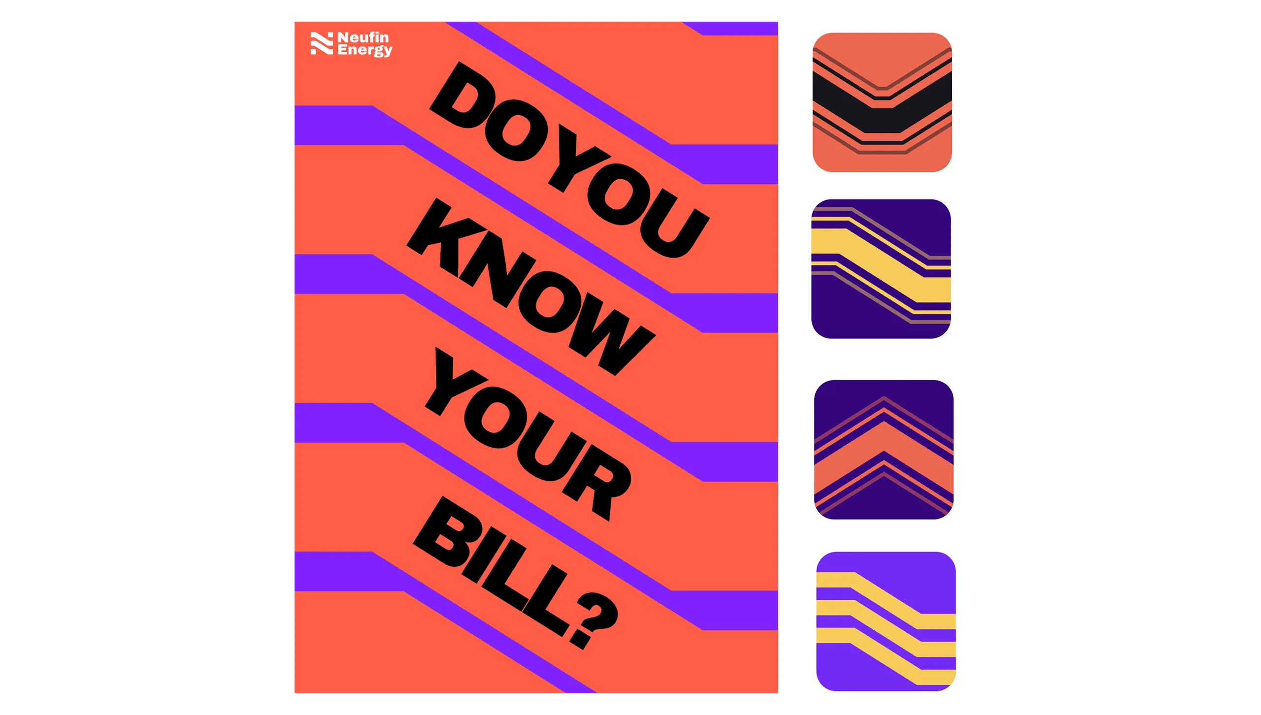
A coral poster reading "Do you know your bill?" across violet Stripe bands, beside four square variations of the Stripe.
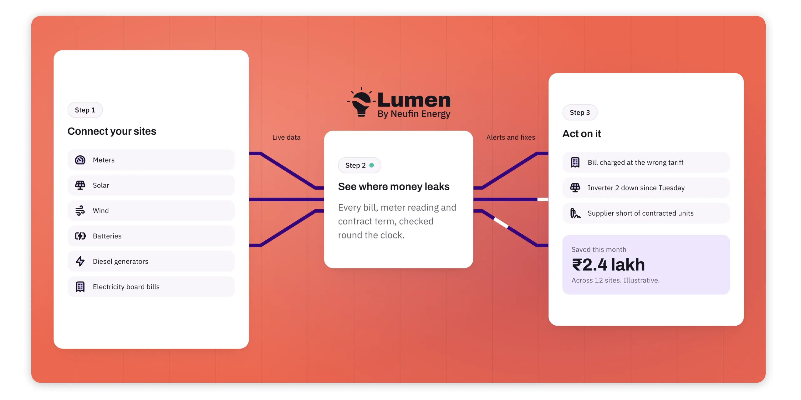
How Lumen by Neufin Energy works: connect your sites, see where money leaks, act on it, with an illustrative ₹2.4 lakh saved this month across 12 sites.
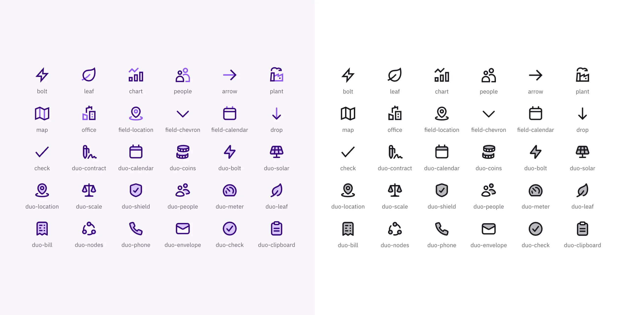
The Neufin icon set in violet and in black: bolt, leaf, chart, solar, meter, bill and more.
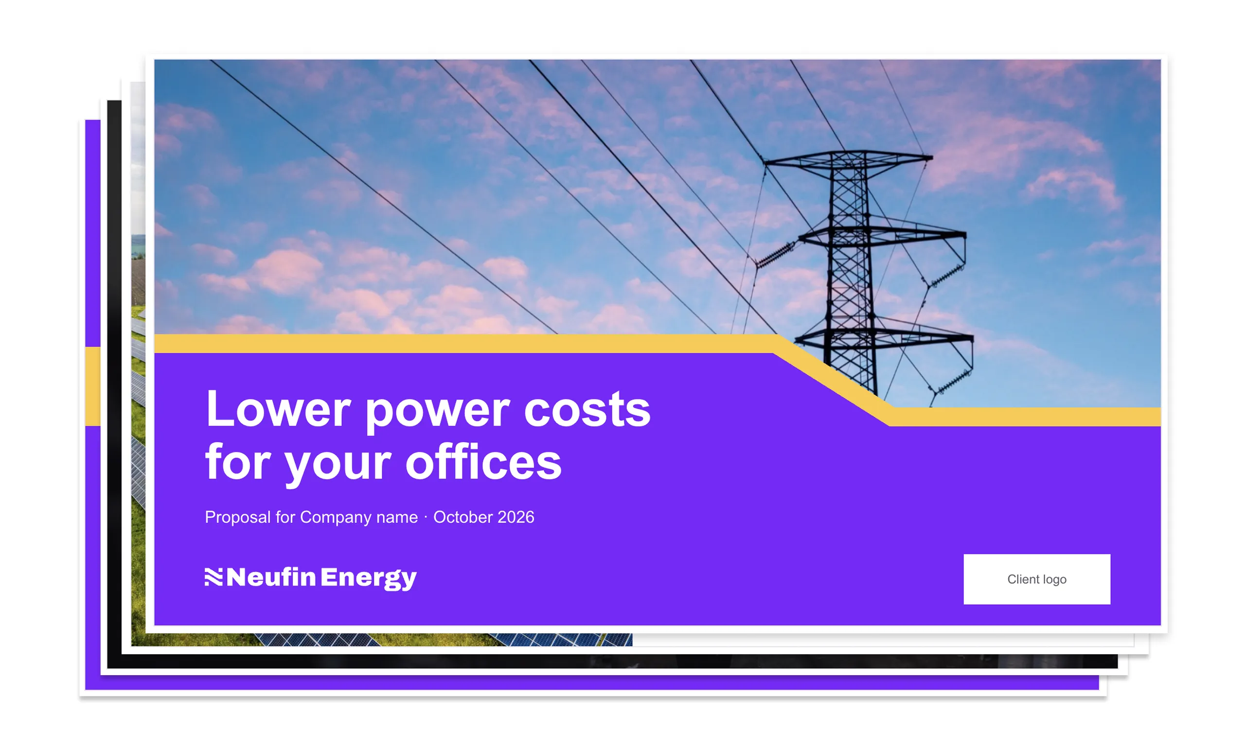
A stack of Neufin Energy proposal slides, the top one titled "Lower power costs for your offices" over a photo of a pylon.

Got something in mind?