Let’s Talk
Back

A shared visual language for India’s payments

  • Client logo
    Client
    Payments Council of India (PCI)
    Industry
    Fintech, Digital Banking, Public Infrastructure
    Duration
    3 months
  • Scope

    • User Research
    • Visual Design
    • Identity Design
    • Marketing Website
    • Icon System Design
  • Impact

    A shared, open-source icon standard for India’s payment ecosystem, made with Amazon Pay, Paytm, NPCI, HDFC Bank, SBI, Visa, WhatsApp Pay and others. The aim is to make payments easier to read and harder to fake.

  • About Payments

    The Payments Council of India represents India’s non-bank payment companies, including Paytm, PhonePe, Razorpay, PayPal and Juspay. It works with regulators to make digital payments more inclusive and trusted.

  • The gap

    Millions of first-time users in India move money by recognising icons, not reading labels. Each app used different symbols for the same action, which caused confusion, broke trust and left room for fraud.

  • The brief

    Create one icon set that works across every brand, language and literacy level. It had to be recognisable without labels, accessible to screen readers and free for anyone to adopt.

  • The approach

    We audited icons across apps and ran working sessions with banks, fintechs and NPCI. We then designed 12 core action icons on a 24px grid, with flexible stroke and radius rules so brands can adapt them without losing meaning.

  • The outcome

    The library launched in December 2022 under the Apache 2.0 licence. It covers send, receive, scan QR, check balance, history and transaction status, and it’s open to every payment app in India.
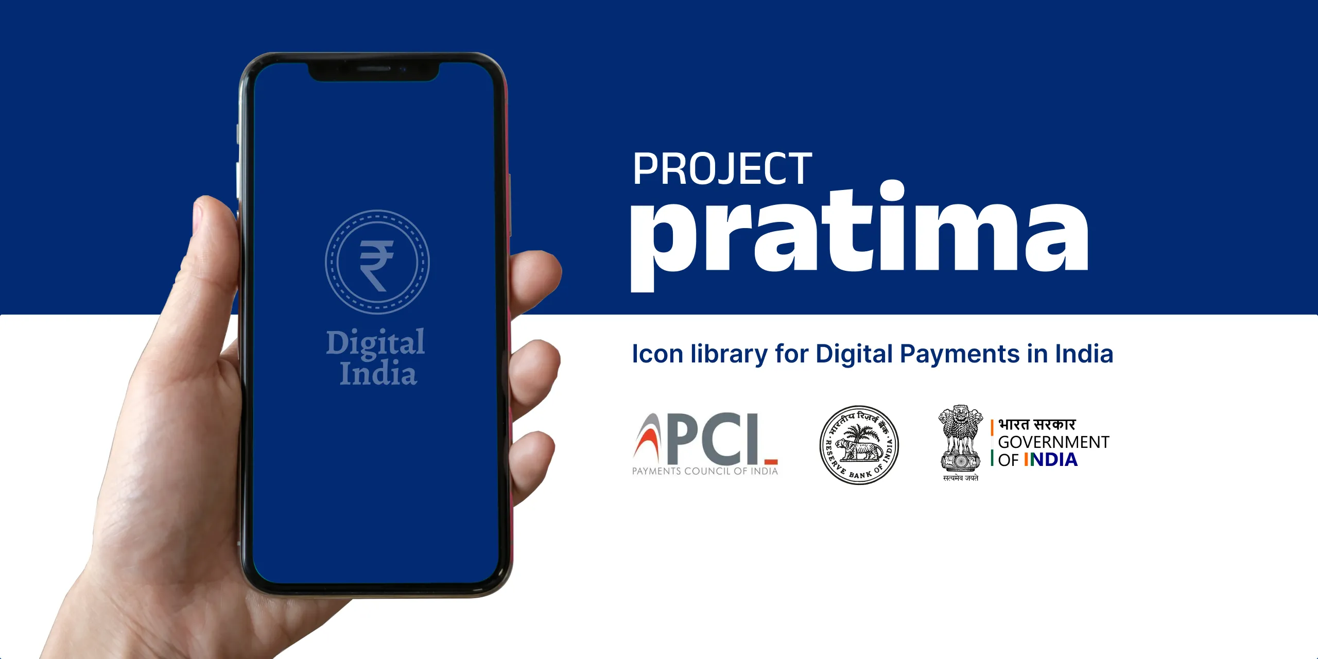
Project Pratima, an icon library for digital payments in India: a hand holds a phone showing a rupee symbol and "Digital India", beside the logos of the Payments Council of India, the Reserve Bank of India and the Government of India.
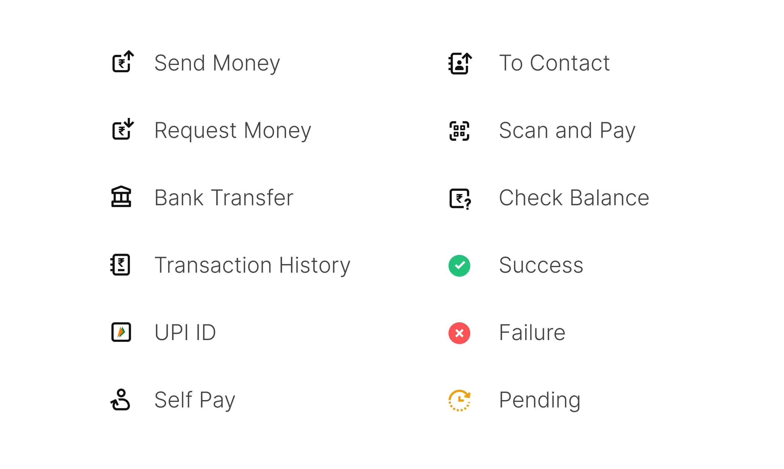
The twelve core icons: Send Money, Request Money, Bank Transfer, Transaction History, UPI ID, Self Pay, To Contact, Scan and Pay, Check Balance, and green Success, red Failure and orange Pending.
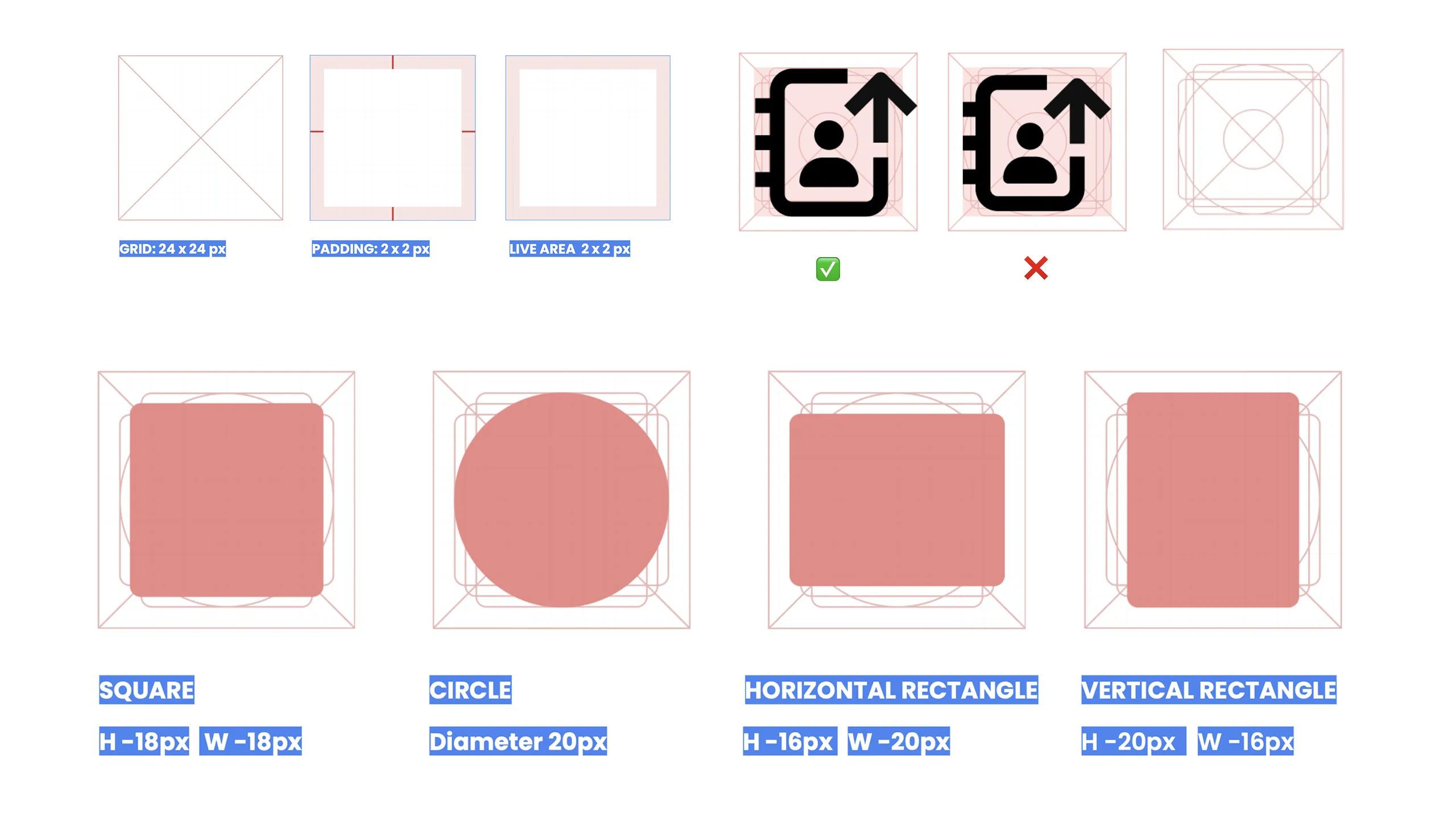
Construction rules: a 24 × 24 px grid with 2 px padding, a right and a wrong way to fill it, and the key shapes: an 18 px square, a 20 px circle, and 16 × 20 px horizontal and vertical rectangles.
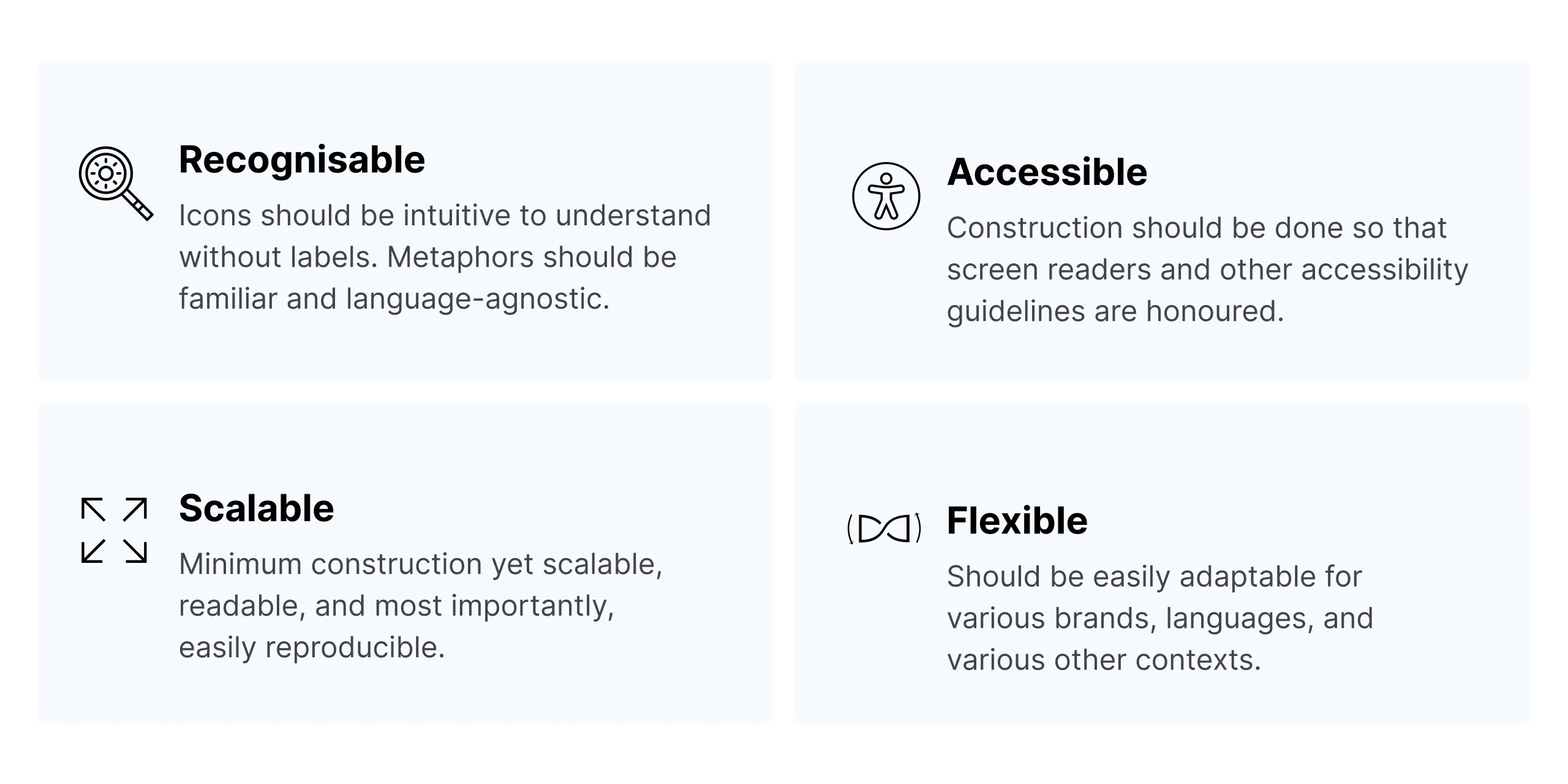
Four principles: Recognisable (clear without labels, language-agnostic metaphors), Accessible (works with screen readers), Scalable (minimum construction, easy to reproduce) and Flexible (adapts to brands, languages and contexts).
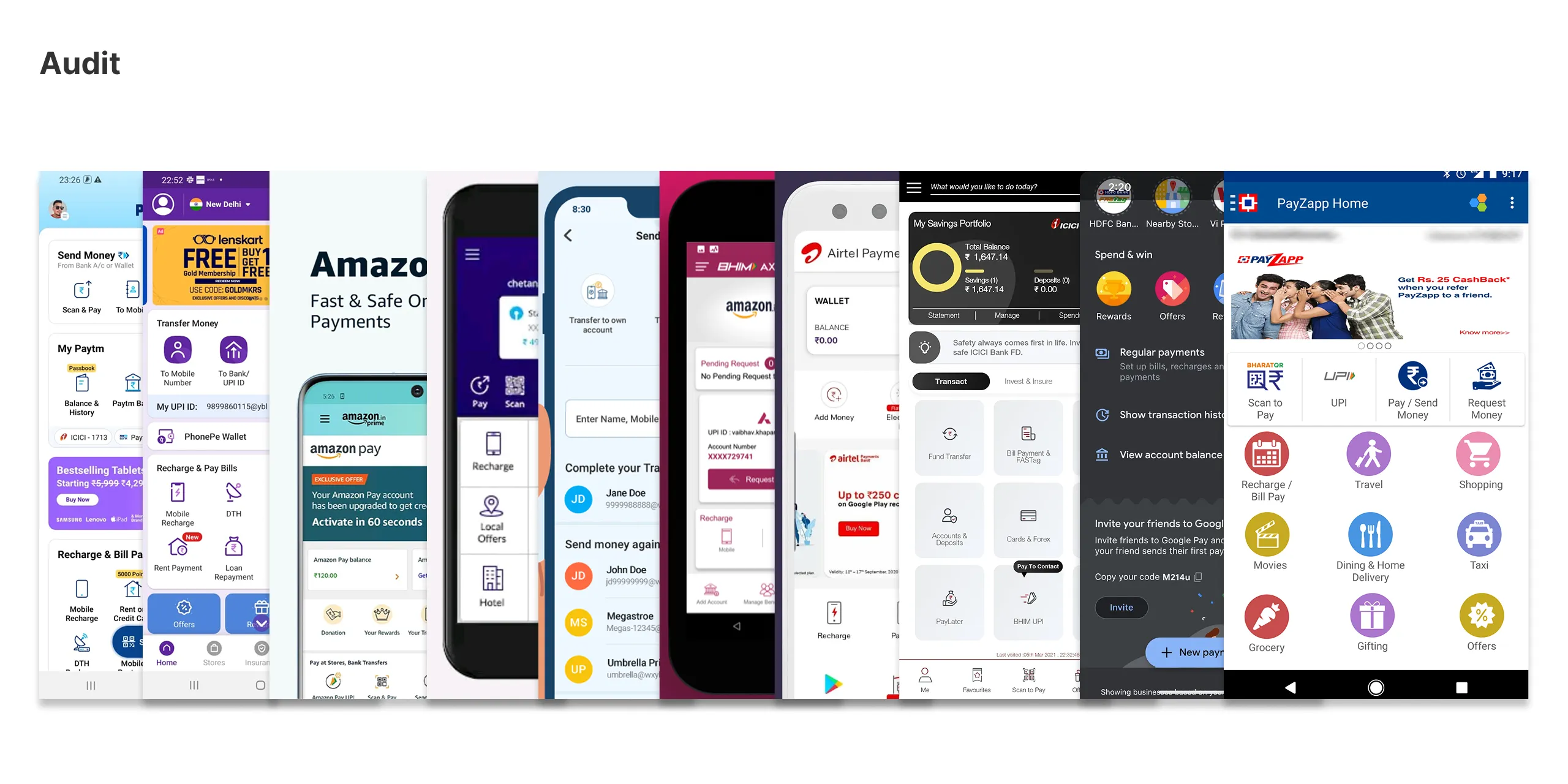
Audit: home screens of Indian payment apps side by side, including Paytm, PhonePe, Amazon Pay, BHIM, Airtel Payments Bank, ICICI, Google Pay and PayZapp, each drawing the same actions differently.
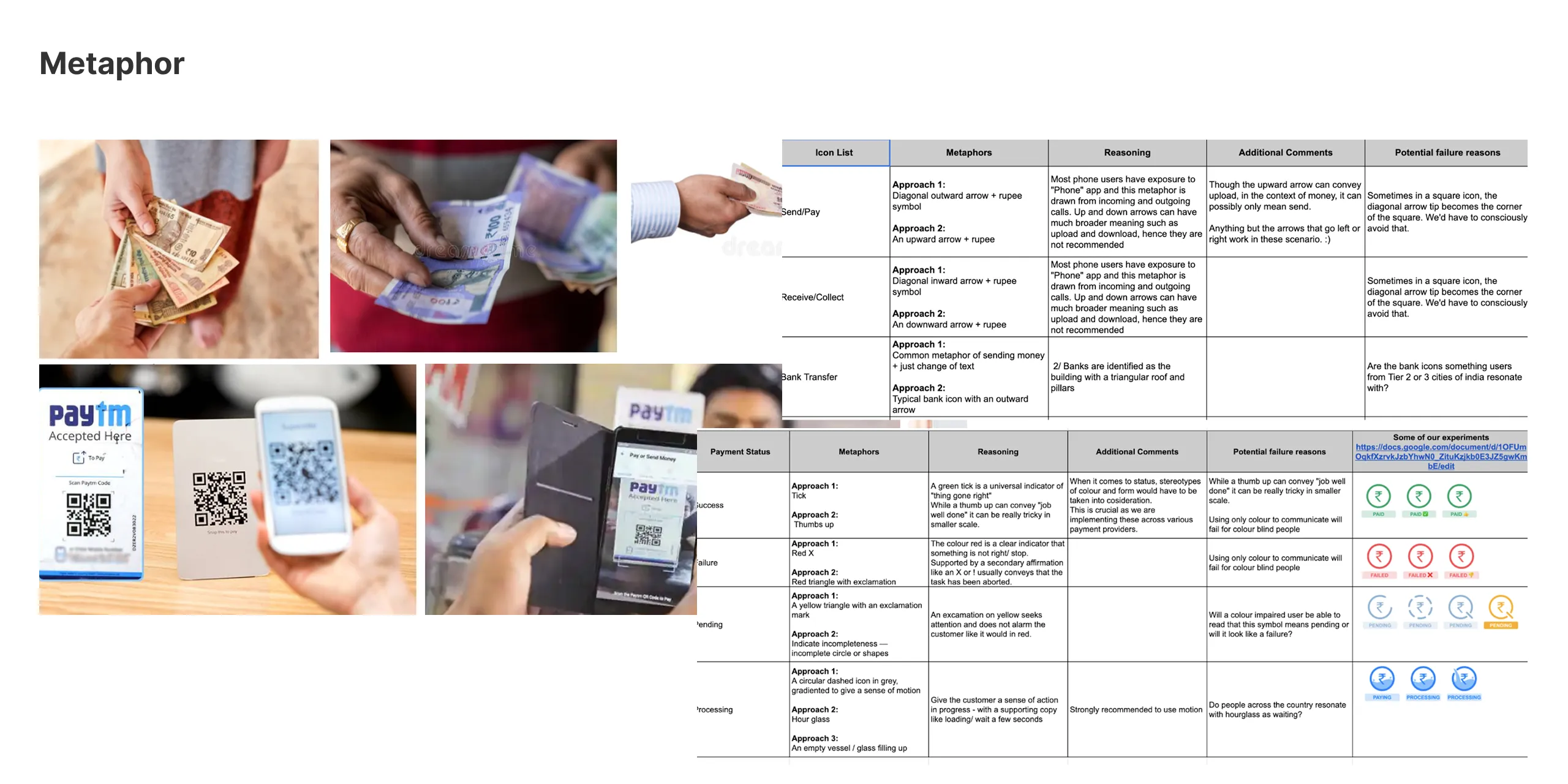
Metaphor research: photos of cash changing hands and QR codes being scanned at shops, next to tables weighing metaphors for send, receive, bank transfer and payment status, with reasons and possible failures.
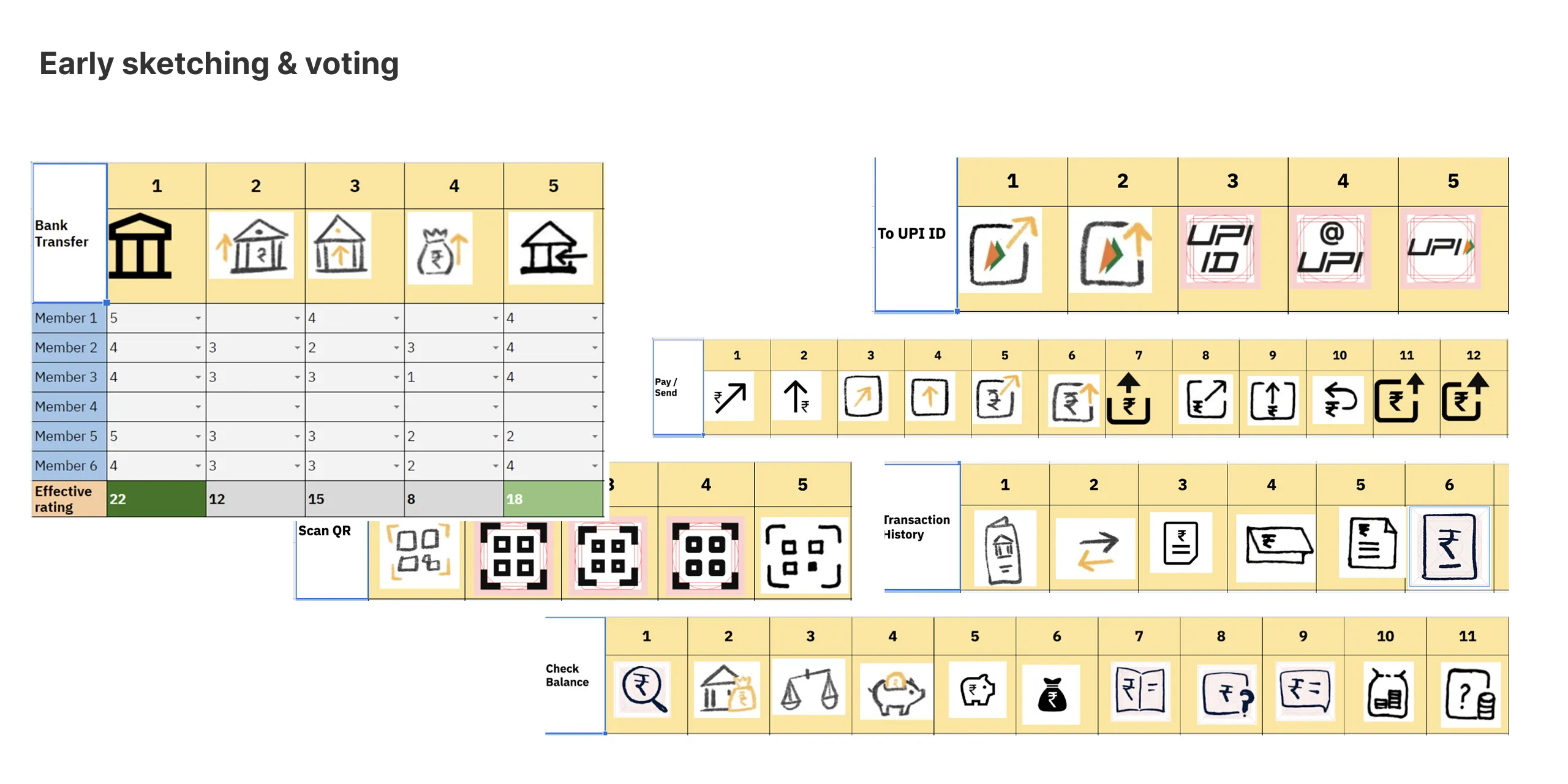
Early sketching and voting: hand-drawn options for Bank Transfer, To UPI ID, Pay/Send, Scan QR, Transaction History and Check Balance, with six team members scoring each option.
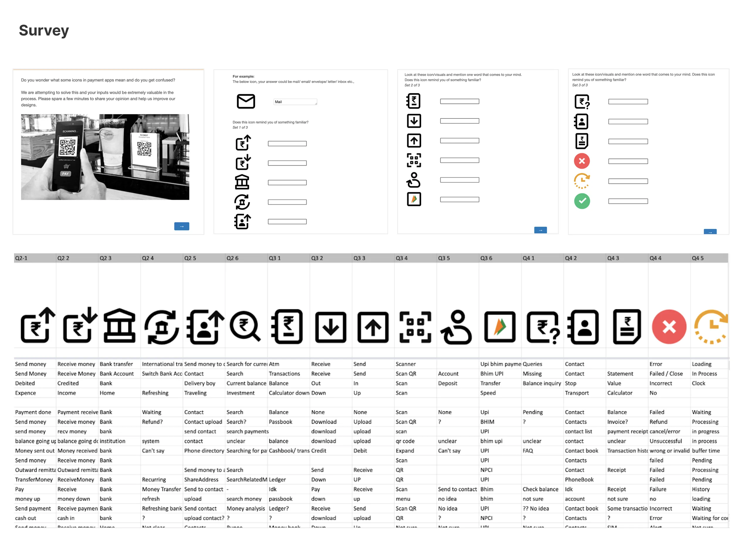
Survey: people were shown each icon without a label and asked what it reminded them of. Their answers are listed under each icon, such as "Send money", "Bank", "Scan QR" and "Failed".
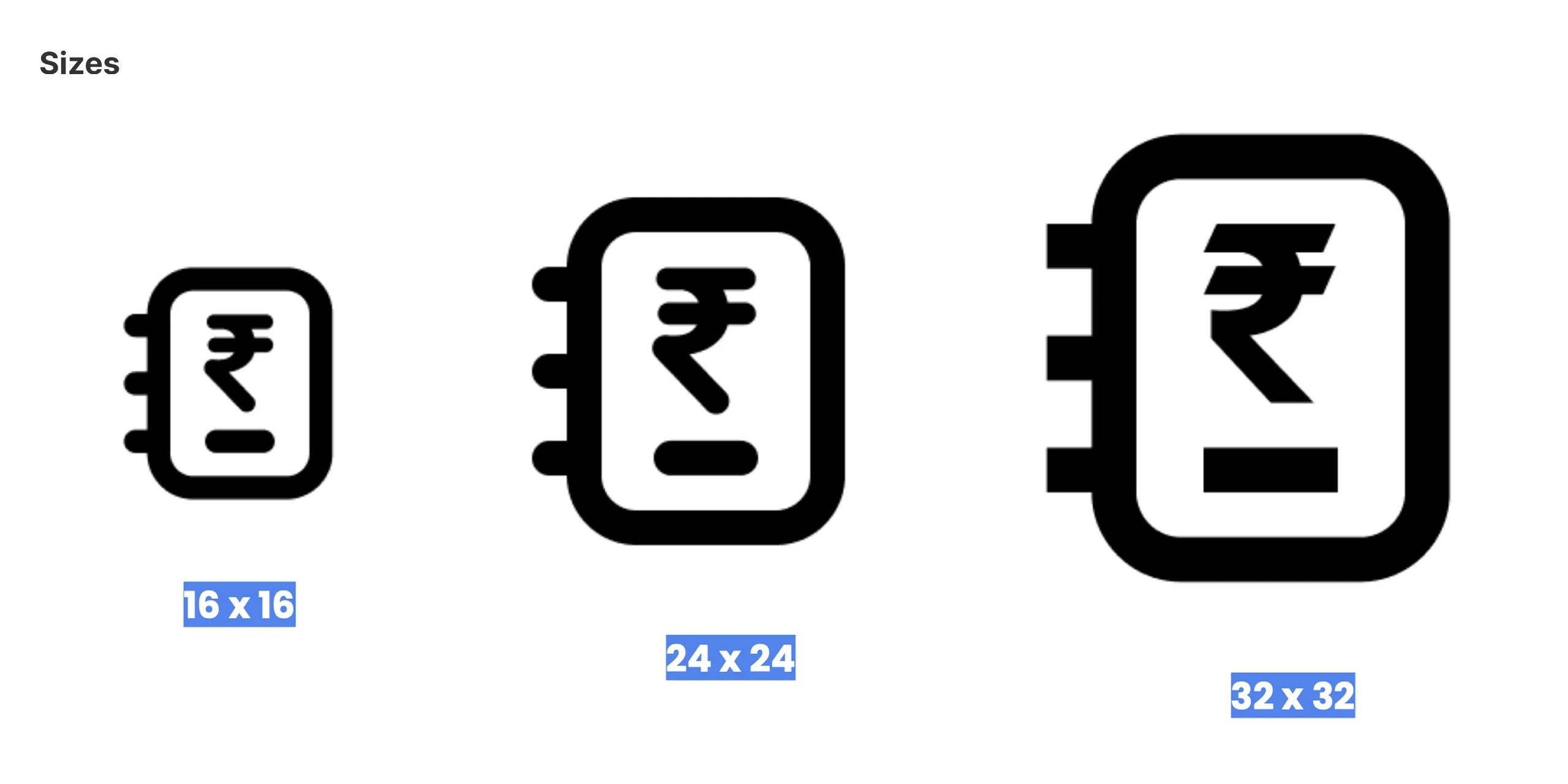
The transaction history icon at 16 × 16, 24 × 24 and 32 × 32.
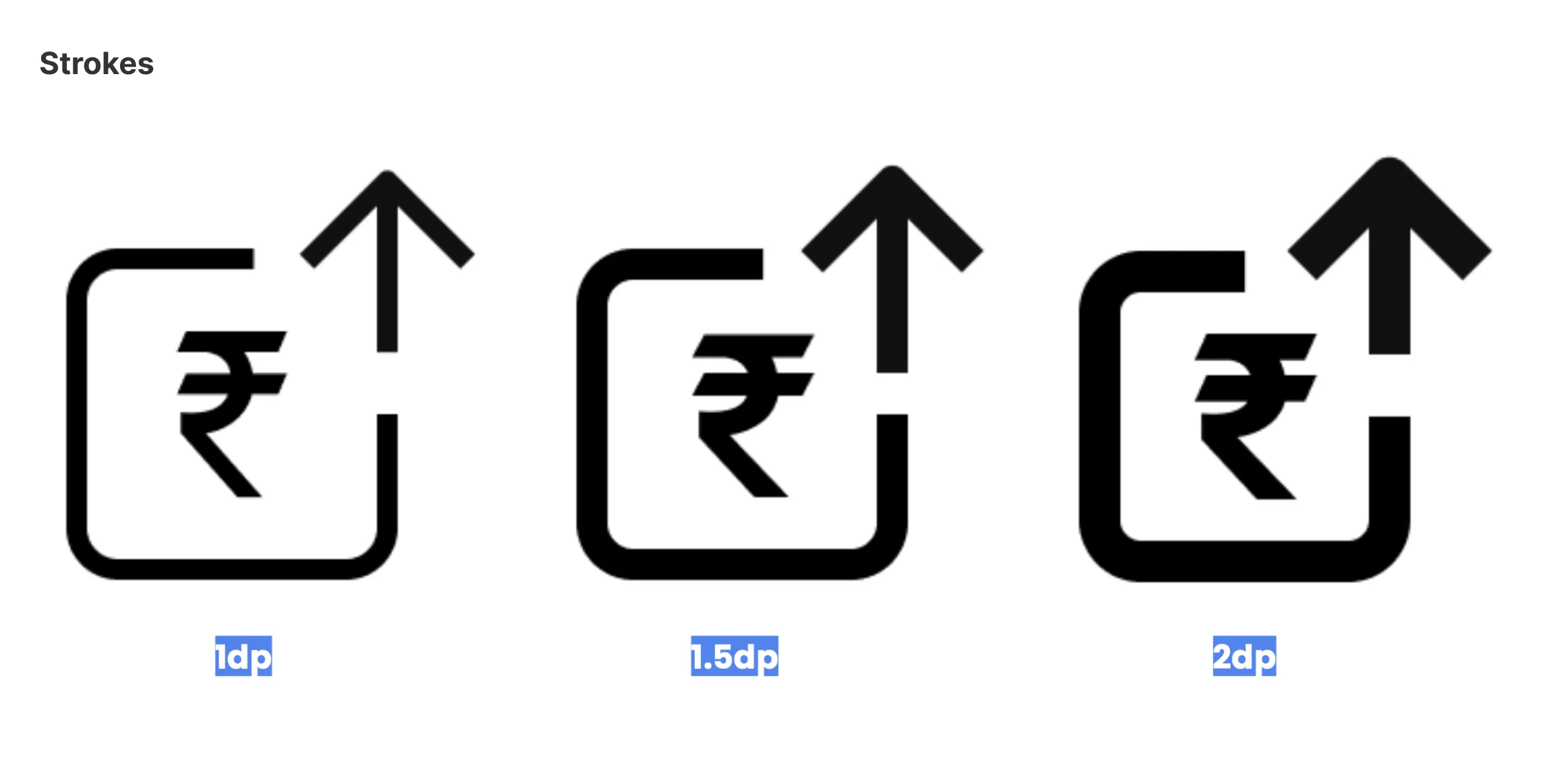
The send money icon at three stroke weights: 1, 1.5 and 2 dp.
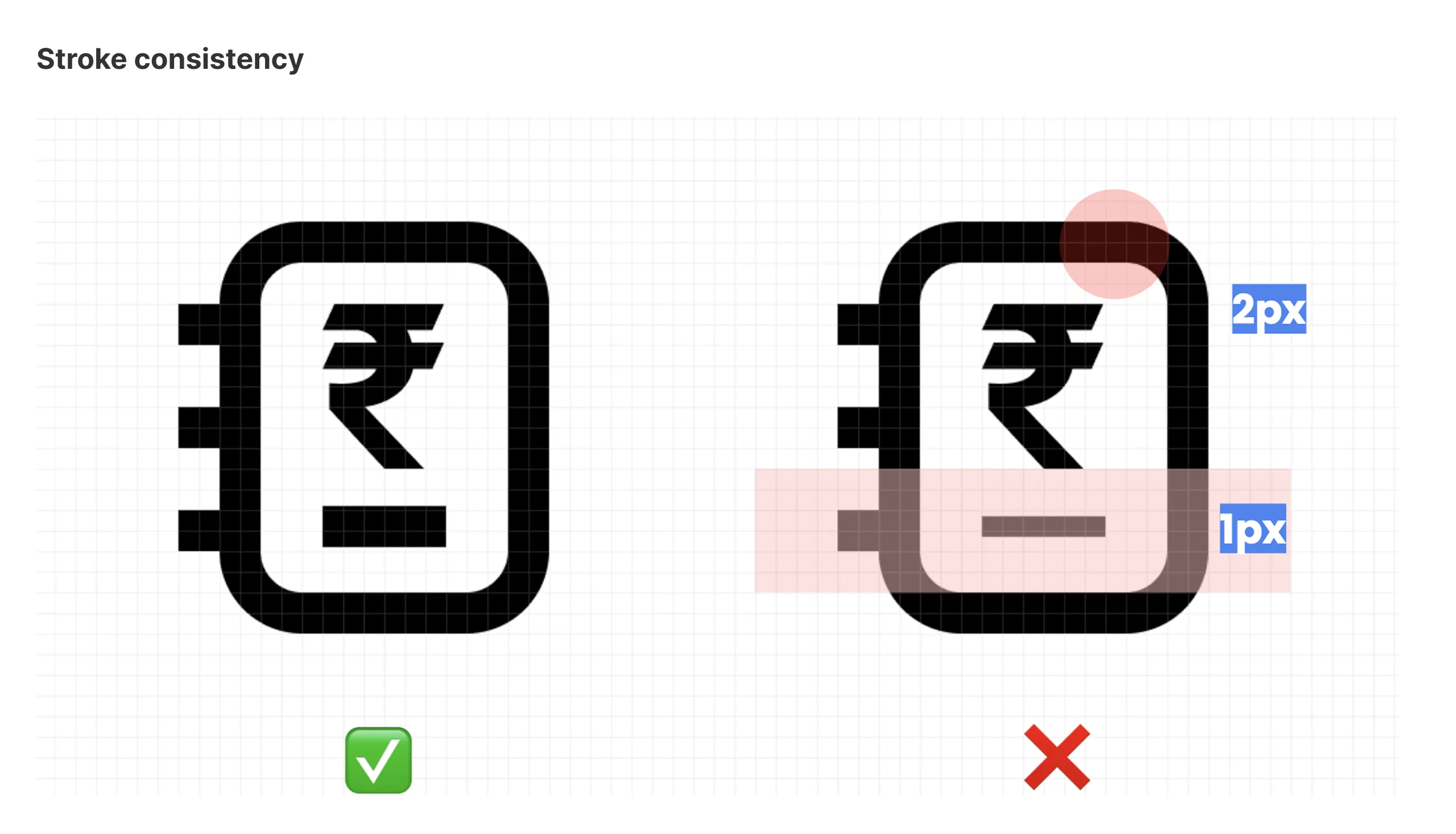
Stroke consistency: the transaction history icon with one stroke weight throughout, marked right, and with 2 px and 1 px strokes mixed, marked wrong.
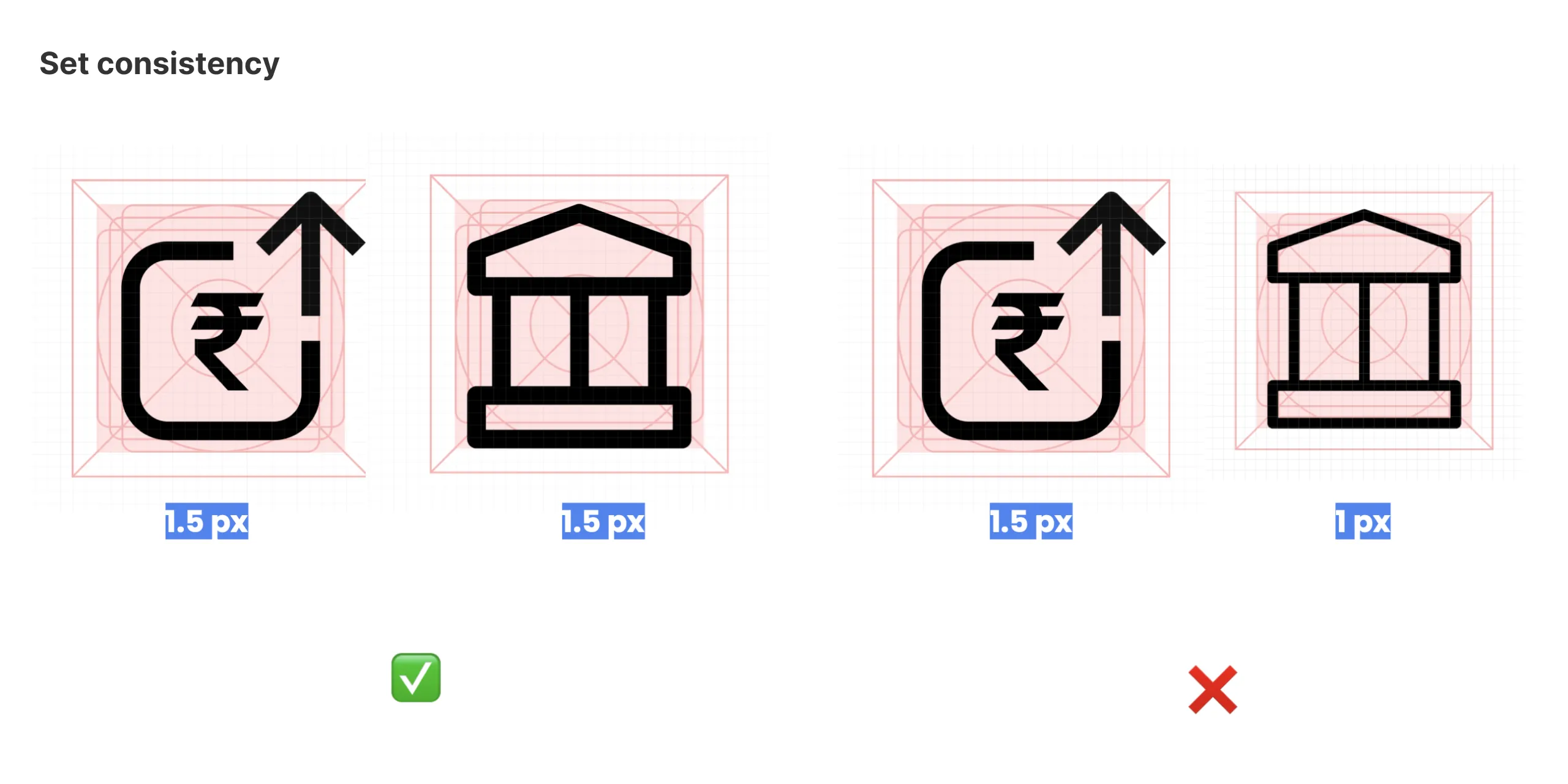
Set consistency: send money and bank transfer both at 1.5 px, marked right, and at 1.5 px and 1 px, marked wrong.
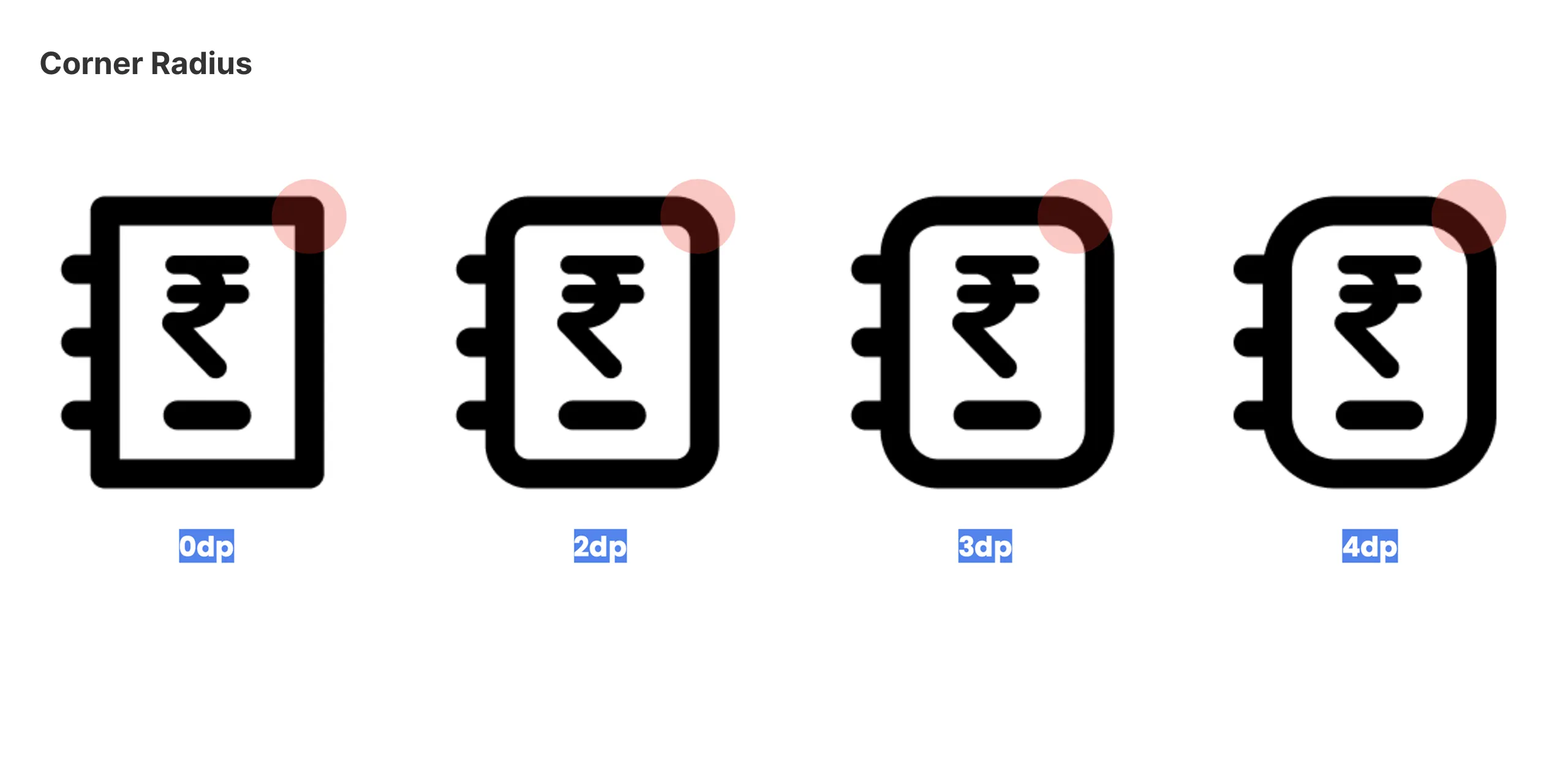
Corner radius: the transaction history icon with corners of 0, 2, 3 and 4 dp.
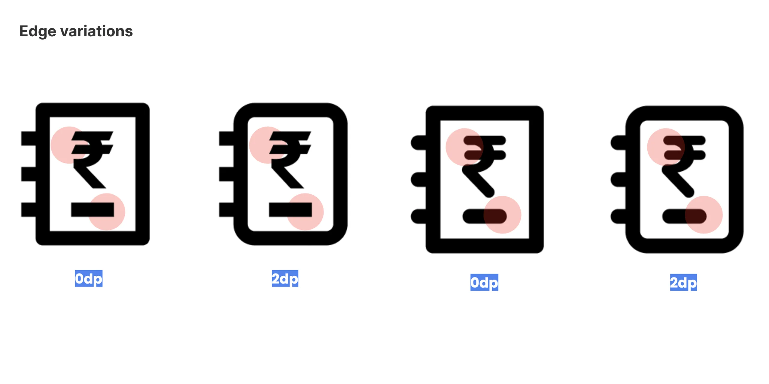
Edge variations: the rupee and the line beneath it with square (0 dp) and rounded (2 dp) ends.
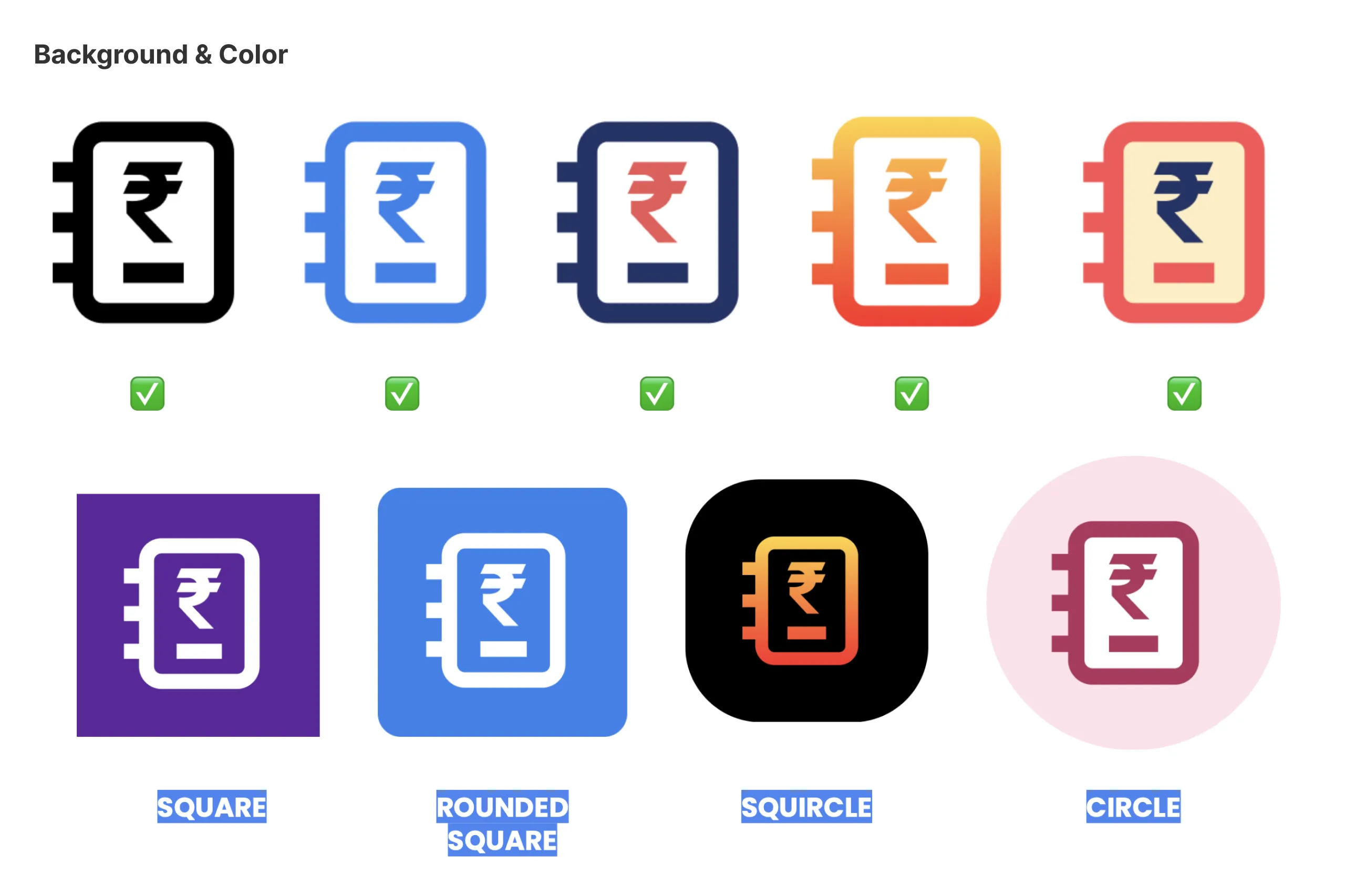
Background and colour: the transaction history icon in black, blue, navy, an orange gradient and coral, all allowed, and on a square, rounded square, squircle and circle background.

Got something in mind?