Why do customers love booking with Cleartrip?
- Client logo

- Status (Live)
- View work (Cleartrip, opens in a new tab)
- Client
- Cleartrip
- Industry
- Travel Tech
- Duration
- 3 months
Scope
- Communication Strategy
- Product Design
- Visual Design
Impact
- 80% of customers came back to book again
- About 30% fewer “is my booking confirmed?” support calls
- About 40% more add-on bookings from the confirmation page
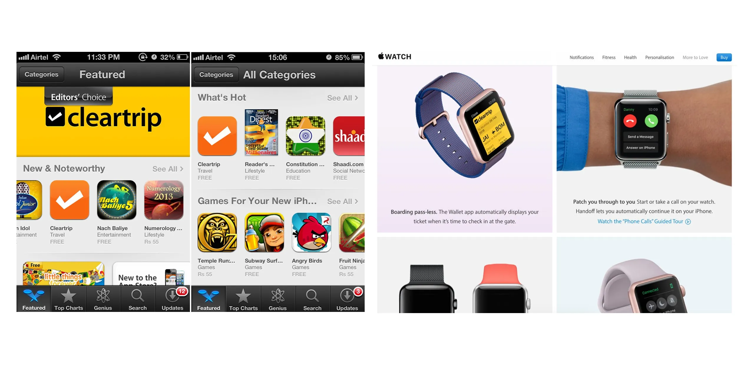
- Featured as an Editors’ Choice app on the App Store
About Cleartrip
Cleartrip is an Indian online travel company, founded in 2006, that sells flights, hotels and trains. Flipkart acquired it in 2021.
The gap
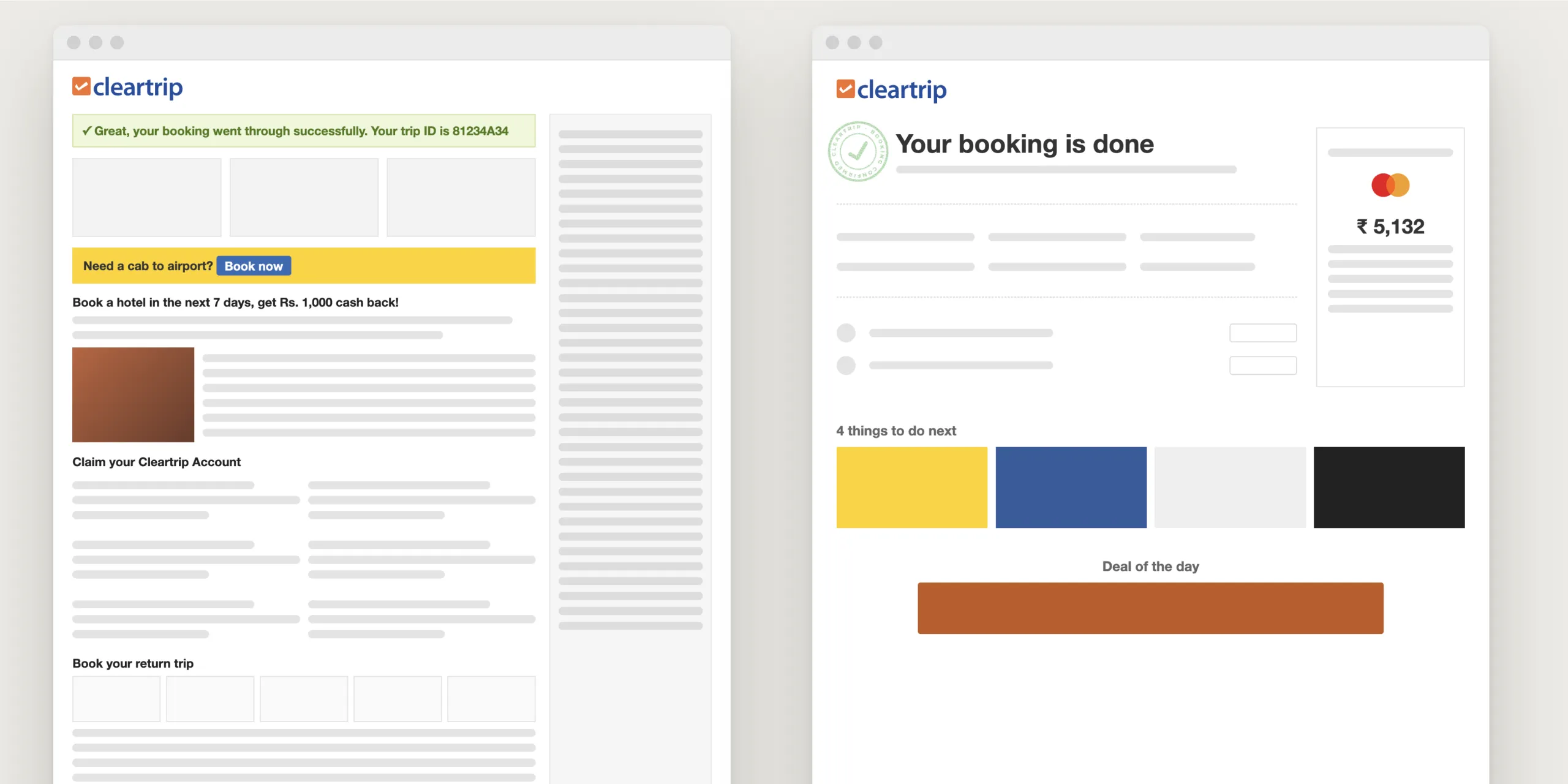
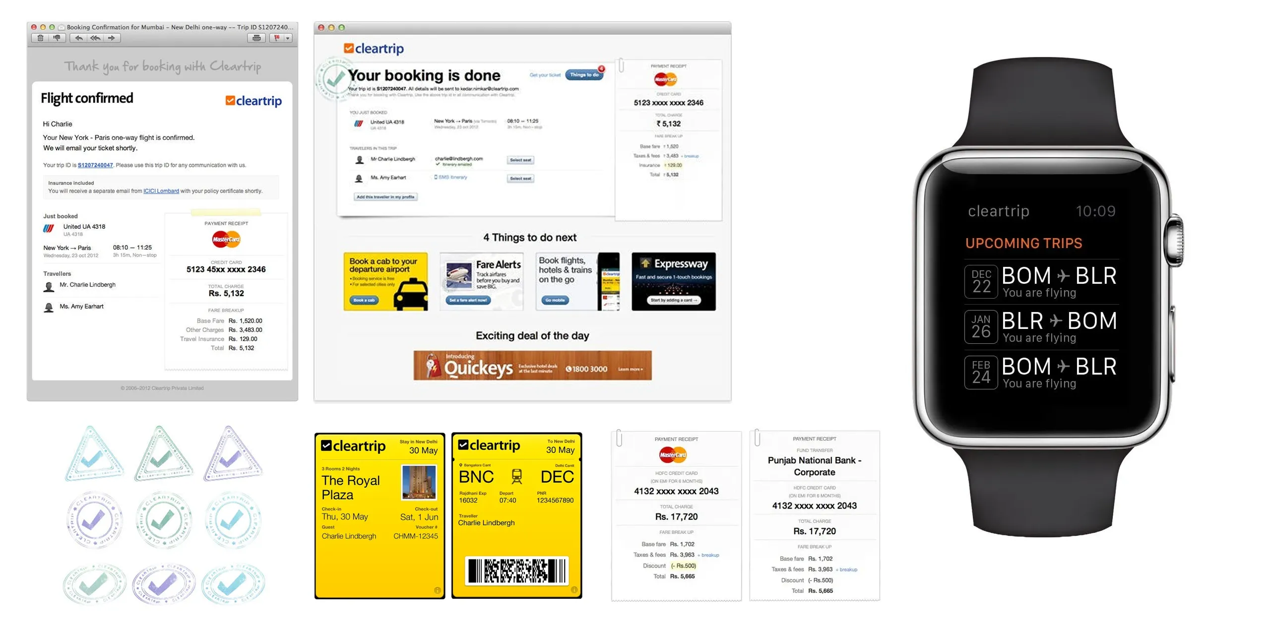
In 2012, Cleartrip’s booking confirmation page had become a dumping ground. Over the years, offers and banners for everything else Cleartrip sold had piled up, and the booking details were hard to find.
The brief
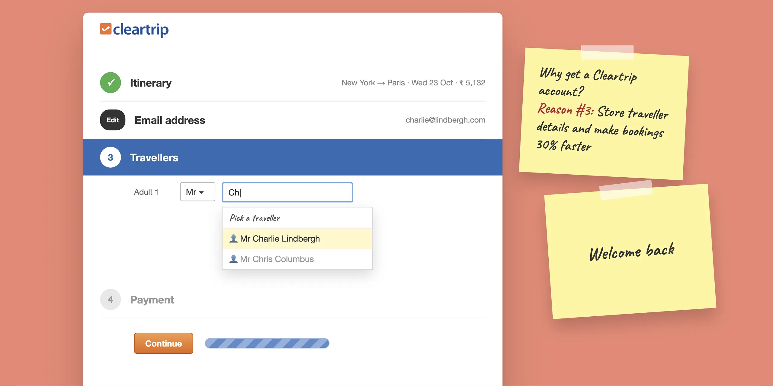
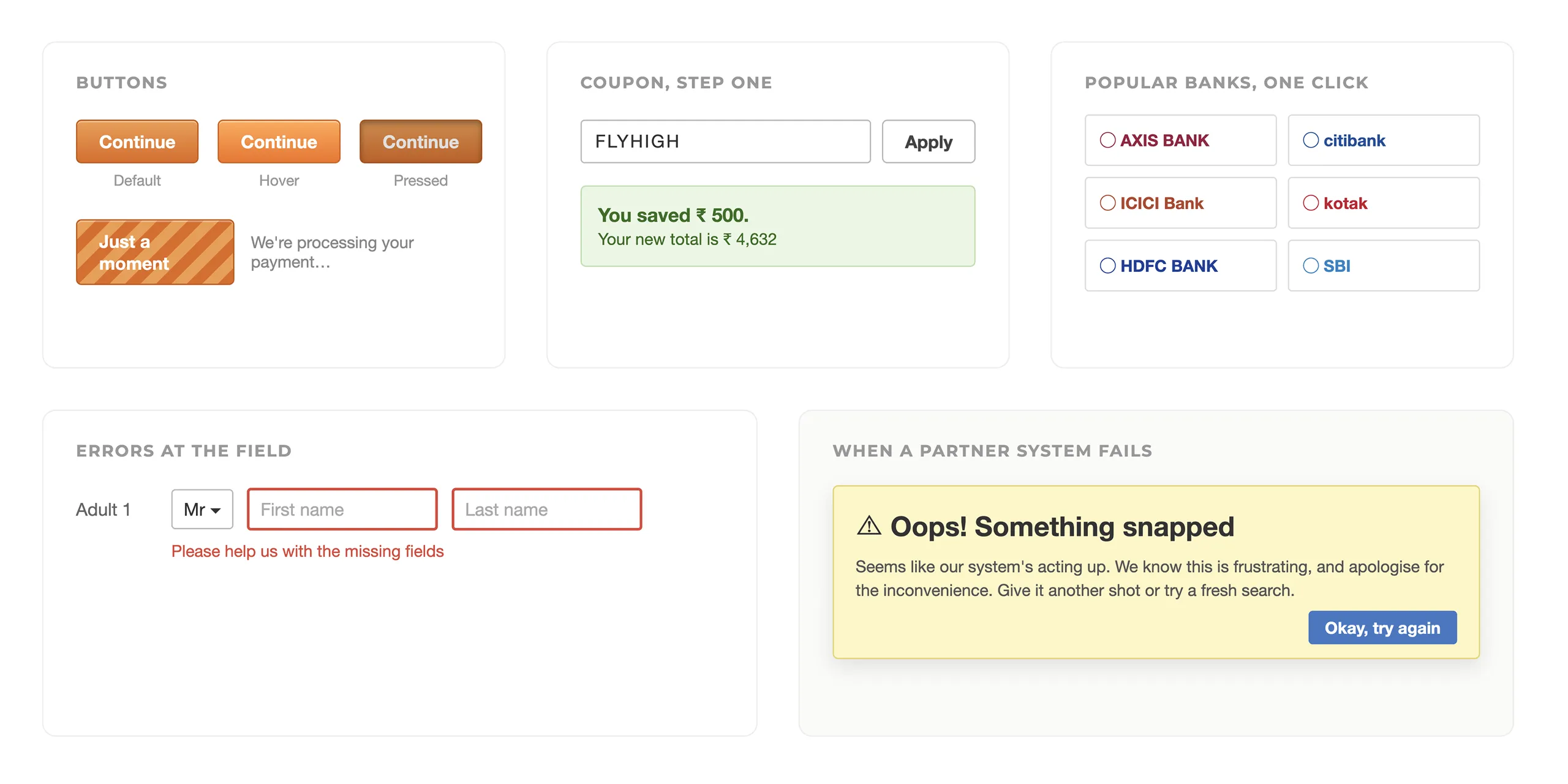
We were redesigning the whole booking flow for flights and hotels. The confirmation page needed to show the booking clearly, offer a few relevant next steps, and stay uncluttered as new things got added later.
The approach
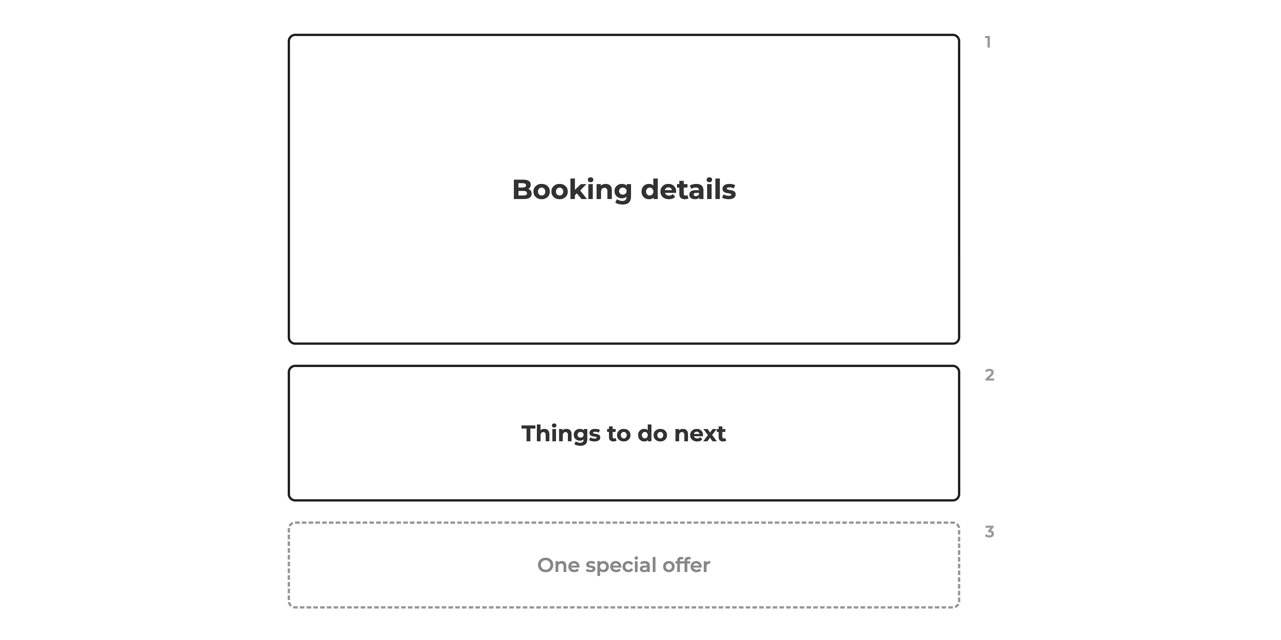
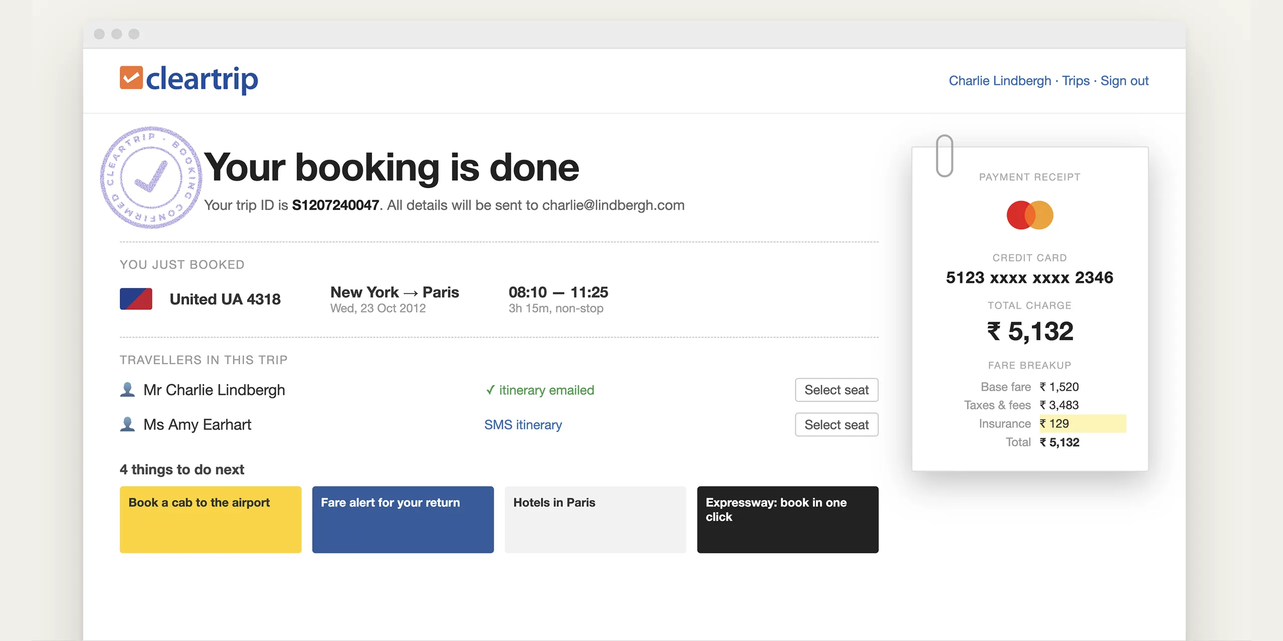
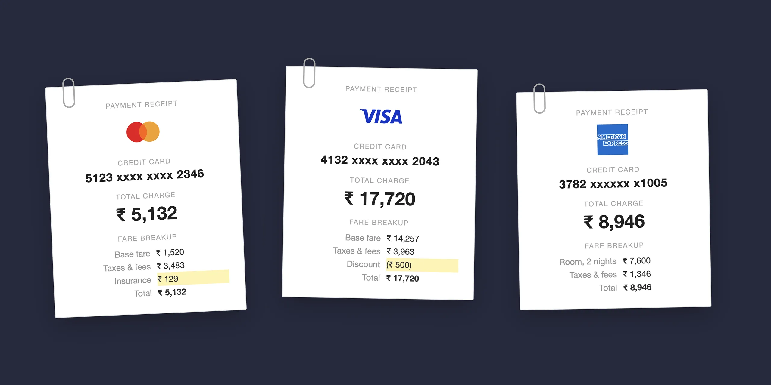
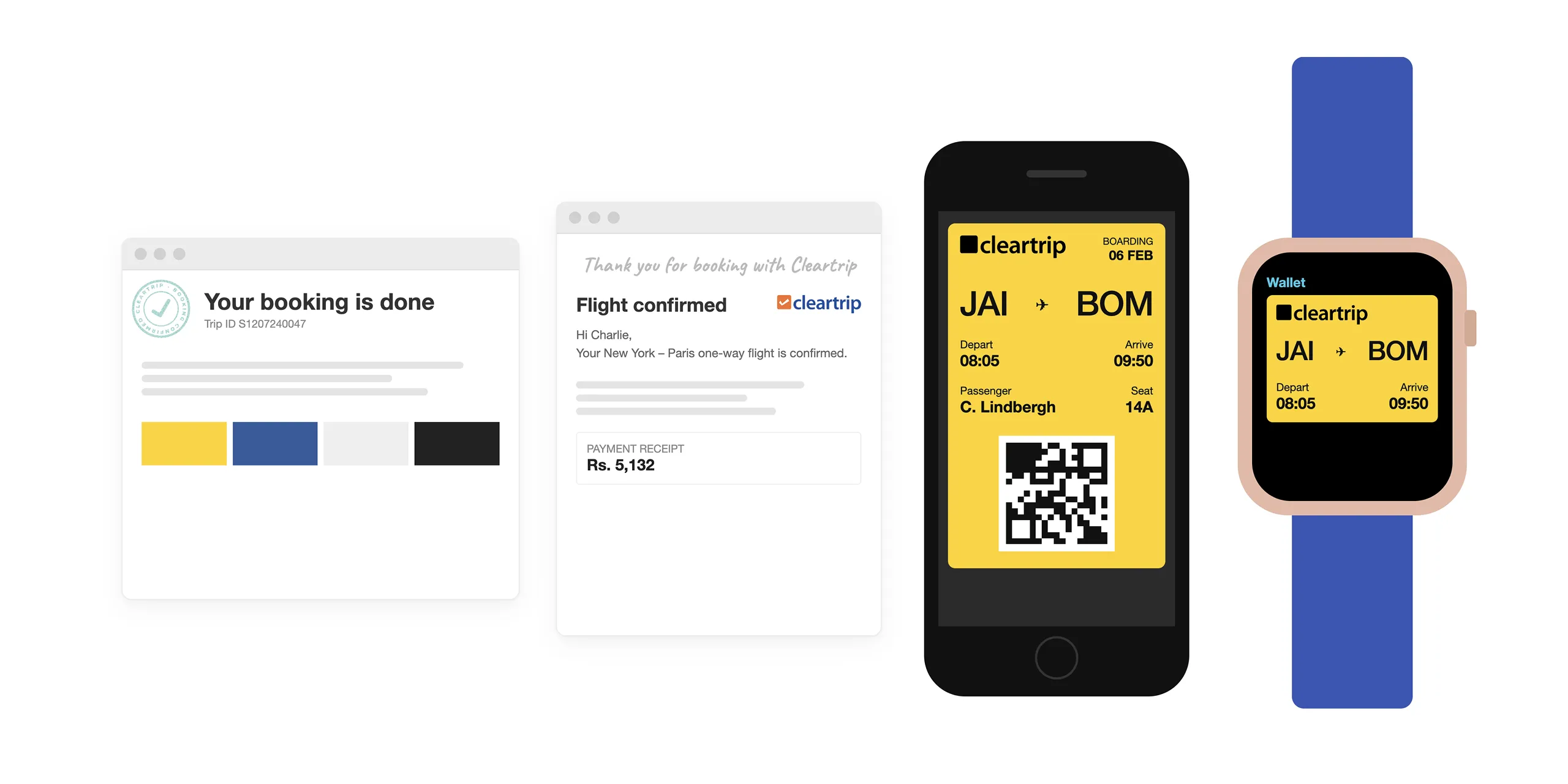
We split the page into three fixed blocks: booking details, four add-ons such as a return-trip fare alert, and one deal of the day. Flight details used a boarding-pass layout with a rubber stamp. A receipt broke down the total cost.
The outcome
- 80% of customers came back to book again
- About 30% fewer “is my booking confirmed?” support calls
- About 40% more add-on bookings from the confirmation page
- Featured as an Editors’ Choice app on the App Store
Got something in mind?